.png?width=141&height=141&name=Transact%20(1).png)


The typical financial institution has evolved over the years by adding pieces of technology as demands arise, leading to a house of cards. Making changes would likely be hazardous because you simply have no idea what could potentially break as a result. Perhaps you've recently joined a team and have been given the eventful task of maintaining or enhancing an organization that you know very little about. By focusing on these key health indicators in your payments environment, you'll be able to get a clear picture of your entire ecosystem. Let's walk through the ten stories that depict the operational tasks that everyone is dealing with these days. Because as they say, a picture is worth a thousand words.
#1: Interchange Availability and Performance
While processing transactions on a platform, organizations commonly extract information directly or run batch reports to get an overview of how the ecosystem is running. Prognosis collects this information in real-time and displays it on a dashboard that makes sense to your business. In the example dashboard view below depicting interchange visibility, the upper left corner shows metrics for all the interchanges we're connected to. It shows the type of transaction, transactions per second, transactions during the current refresh interval, amounts processed, approval rates, response times, etc. The top middle pane shows metrics for credit vs. debit transactions and the top right column shows EMV vs. mag stripe transactions.
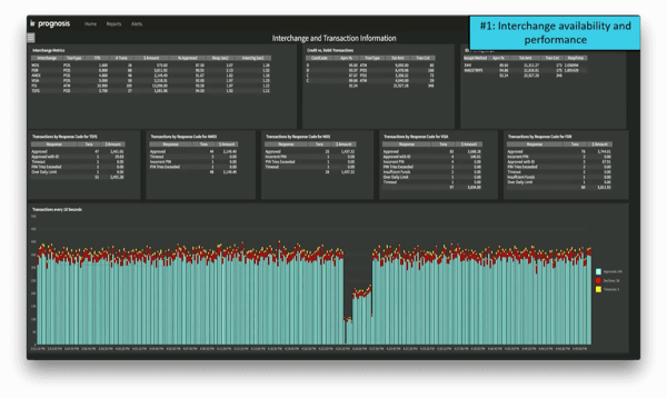
The middle row shows information about each individual connection point, including approvals and denials. The bottom pane focuses on the overall landscape of approvals/denials/timeouts over 10 second intervals. If you glance at this diagram, you can clearly see a dip in transactions in the middle, which could signify some sort of hardware error or networking issue.
#2: Individual Issuer Performance
This second example demonstrates how we can gain visibility into user performance. In our case, we're slicing and dicing real-time data to give visibility into all the different issuers that your organization is processing for (assuming that you have access to this type of data). In the upper left-hand corner is, again, a view of credit vs. debit transactions. The middle pane shows issuer by card code and state, which gives an overall view of what is occurring in various regains of the country. The upper right-hand side shows how each individual issuer is performing.
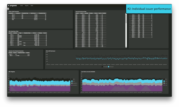
In the second row from the top, we have a view of EMV vs. mag stripe vs. tokenized transactions. In the next row is a pane dedicated strictly to tokenized vs. non-tokenized transactions. Next to that is a graph of ATM vs. POS total amount. The bottom left shows EMV vs. mag stripe, and the lower right shows issuer volume by card code. This gives a nice view of all the different metrics that may be concerning to an issuer of cards.
#3: Approval Rates
This story depicts more of an overall view of approval rates, along with how the switch is performing from a KPI standpoint. Here you'll obtain a traditional view into how the platform is processing in terms of the POS. In the very upper left corner of the example shown below, the total amount processed is displayed for this particular refresh rate. It depicts transactions per second, approval rates, and active terminals within the environment. The top left column shows issuers with the longest response time and the top right shows POS transactions by merchant. The left pane in the second row displays issuers with the most declines. As you can see, two of the columns in this pane are highlighted yellow. This is a visual alert based on set parameters, illustrating that the approval rates and response times are outside of normal boundaries for this particular issuer. (If the trend continues, you might choose to be notified by email or SMS because there could be an issue with this particular processor.)
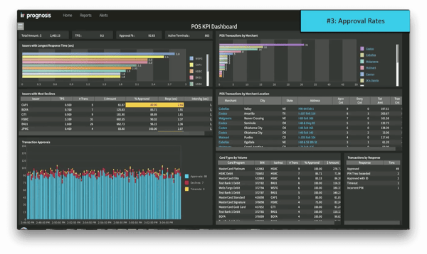
The second row on the right-hand side shows POS transactions by merchant location, which allows you to dig down into individual merchants. (We'll dive deeper into the performance of a specific store in item #4.) On the lower left corner, we have a graph of transaction approvals, which shows how the whole switch is performing. The lower right shows card types by volume.
#4: Store and Regional Terminal/Transaction Availability
In the depiction below, we're drilling further into the data for a specific merchant (Superstore 2). (This view shows similar types of information to the previous item.) The top left corner shows issuers with the longest response time. In the second row, we can again see a visual alert in the volumes where the response time is longer than normal for one of the issuers. We can also see the performance of the individual stores associated with Superstore 2 in the upper right. Again, the bottom right corner shows card types by volume along with the associated response times.
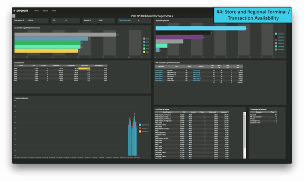
We can then drill down into an individual location for Superstore 2. In the depiction below, we're looking at a single store located at I-27, exit 116. The upper left corner shows transactions by issuer, while the upper right shows denied transactions by response code. The second row, left-hand side shows transactions by BIN, and the right-hand side shows transaction totals by terminal. If there are multiple terminals at this particular location, this pane allows you to actually drill down further and look at each specific terminal. Here, again, you'll see the yellow highlighted visual alert on the deny percentage. If the trend continues, it may be indicative of a PIN pad problem, terminal connection issue, or another physical issue with the terminal itself.
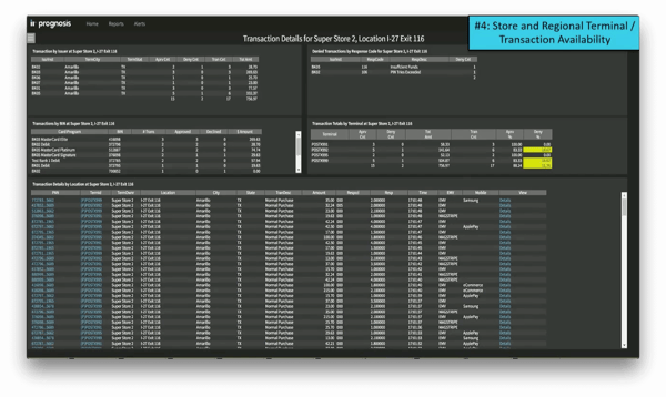
The bottom pane focuses on all the individual transactions within this particular store location. In this case, you'll notice that the PAN is masked. It also shows the terminal ID along with all the metrics accompanying each transaction. On the far right, you can click on 'Details' to drill down further into any individual transaction. This story gives a view into the processing of transactions, from approval rates all the way down to transaction availability.
#5: Revenue Breakdown Between Revenue Types
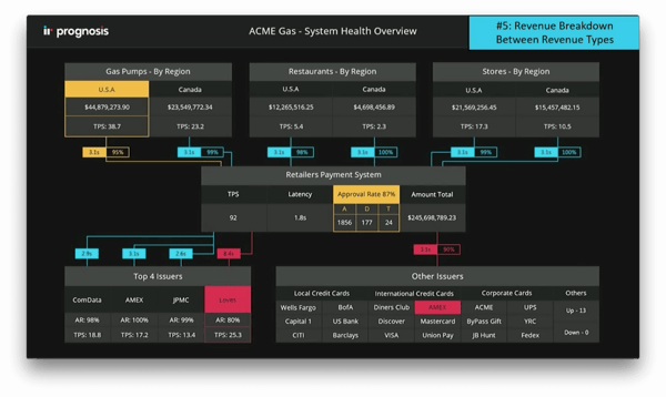
Below is an overall view of an entire processing environment. This type of dashboard view is compelling because it breaks items down by product type. In this case, we're looking at a processor for truck stops, which includes gas pumps, restaurants, and convenience stores by region. As you can see, this view also has visual alerts built around individual metrics. On the upper left is a yellow alert showing that approval rates are lower than normal. The information gets filtered down into the payment system itself in the center pane, and then drills down further into the issuers and authorizers of the card transactions. (This example demonstrates how it's possible to actually drill down all the way through the transaction path and gain visibility into the entire ecosystem.)
#6: Fraud Rules
Prognosis isn't a full-fledged fraud product, but it is possible to apply rules to realtime transactions in order to isolate anomalies or look for certain conditions in the environment that may indicate abnormal patterns in transactions. You can deploy these kinds of rules very quickly by making a simple change of configuration. The example dashboard view below shows a list of three rules that have been deployed: a geography check because the same PAN cannot possibly be used in two different physical locations within the same time period, a multiple preauth rule to see if someone is performing a transaction to check the validity of a card, and a suspicious card rule that might find $1 transactions at gas pumps.
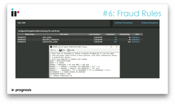
The dropdown box at the bottom shows the simple script used for the 'suspicious card' rule. This is how you can quickly and easily enter a pattern and deploy new rules that look at every transaction flowing through the system.
#7: Availability of Token Management Service
This next story gives visibility into tokenized transactions. Most merchants and processors are probably already in the process of deploying and supporting Apple Pay, Samsung Pay, or some other kind of tokenized transaction within the environment. It doesn't just involve transactions, but also activation/registration for a particular card along with any associated administration. Prognosis' dashboard gives visibility into the configuration, along with a tokenized vs. non-tokenized transaction view across the entire payments platform (shown in the upper left corner of the example below).
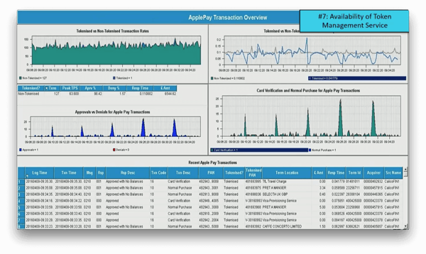
You can also see the response time differences between tokenized and non-tokenized transactions in the upper right corner. (This is a critical piece of information. You will likely get different total response times due to using a token service or some kind of external entity that provides a tokenized PAN.) In the left-hand side of the second row, you can see the non-tokenized transaction response times, Peak TPS, etc. Under that is the approvals vs. denials for Apple Pay transactions. On the right side of this column we can see call verification and normal purchases for Apple Pay transactions. The bottom pane shows a table with relevant transaction details. In the seventh column of this table, we get visibility into whether it was a card verification or normal purchase.
This kind of display provides valuable information that can allow you to plan in advance for situations you otherwise wouldn't have anticipated. For instance, while working with partners and customers, we've found that services like Apple Pay send update information for registered cards in large batches. That results in a significant spike in connections to third party services, which can potentially be problematic.
#8: Stored Value/Gift Card
If you're handling stored value/gift cards within your organization, there are some areas you must consider to ensure maximum visibility and uptime. A wealth of information is at your fingertips—it just needs to be put to good use. We recently worked with a merchant who simply wanted a notification whenever the database would grow. To them, this was a clear sign that stored value/gift card processing was occurring. If an organization had nothing in place, this kind of strategy might be a good stepping stone in the right direction. However, we have the ability to pull information together to look at the actual cards. (We can see the number of activated cards, cards with expiration date, etc.) It's a good idea to take it a step further and look at the account information as well.
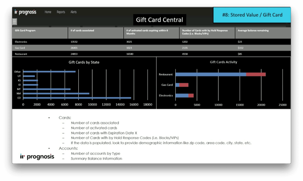
You may be thinking that this is outside of the scope of what you need to accomplish. However, consider how you can leverage this level of visibility. (You might even be allowed to work remotely from the beach because of the value you bring to the organization.)
#9: Supporting Services/Applications
Your organization probably has a collection of different systems that could be categorized as critical or important to ensure a healthy payments environment. The switch is obviously the heart of the ecosystem. However, consider the surrounding components as well—what other systems need to function in order to avoid customer calls? Once you identify these systems, you can perform some simple health checks (or schedule automated checks), perhaps run a few scripts, and create a categorized list. Even better, it might be useful to bring these components into a single view with health indicators, as illustrated below. This leverages a feature called Live Canvas, which brings all your systems together into a useful visualization.
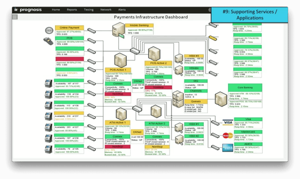
Live Canvas takes a Visio diagram of a processing environment and integrates it with the realtime Prognosis data to create a visual display. In the upper left corner of the example above is the online payment channel. In this case, we're visualizing the approval rate and transactions per second. As you work your way down, you can see different channels of acquiring endpoints. They might be grouped together by partners you're receiving a transaction from, or by regional ATM or POS devices. (We can also drill down into the actual IT infrastructure.) Data metrics being collected in the background can be applied to all those endpoints, and a visual notification can be displayed if an issue occurs.
Further to the right, you can see the security modules where encryption processing is being performed. You can also see other channels connecting out—in this example, we have an MQ channel connecting out to core banking. In the far right, we can see connections to certain authorizers (e.g., host interfaces or interchanges like Visa, MasterCard, Amex, etc.). Of course, you can drill down from this live display into individual detailed sub-displays. This is a convenient way to get the health of the entire path, at a glance.
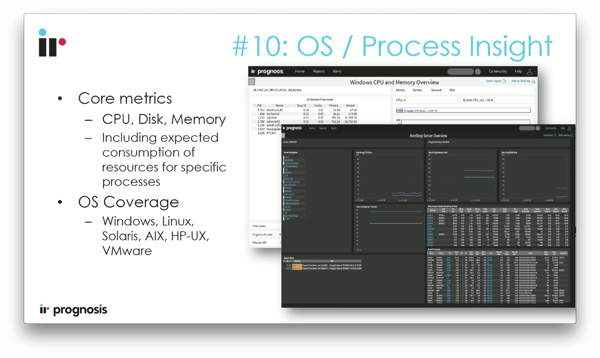
#10: OS/Process Insight
OS/process insight is an obvious area, but it's often overlooked. Capturing this kind of information will inevitably prevent headaches in the long run. If for some reason your organization doesn't already have OS-level visibility covered, you should put something in place to warn if there is an issue with disk, CPU, memory, or general OS error messages. A basic example would be to take a snapshot of all running processes if the CPU hits 70% utilization. To take it a step further, you can correlate the CPU with application performance. If there are random CPU spikes that do not correlate with an increase in transactions, you might want to receive an alert.